
ENROLL.HEALTH GUIDES PEOPLE THROUGH HEALTH INSURANCE WITH LESS CONFUSION AND MORE CONFIDENCE. A MODERN REDESIGN THAT PUTS USERS FIRST AT EVERY STEP.
Market Size

Our Team


Policies sold every day
through 400+ agents
About & PURPOSE OF enroll.health
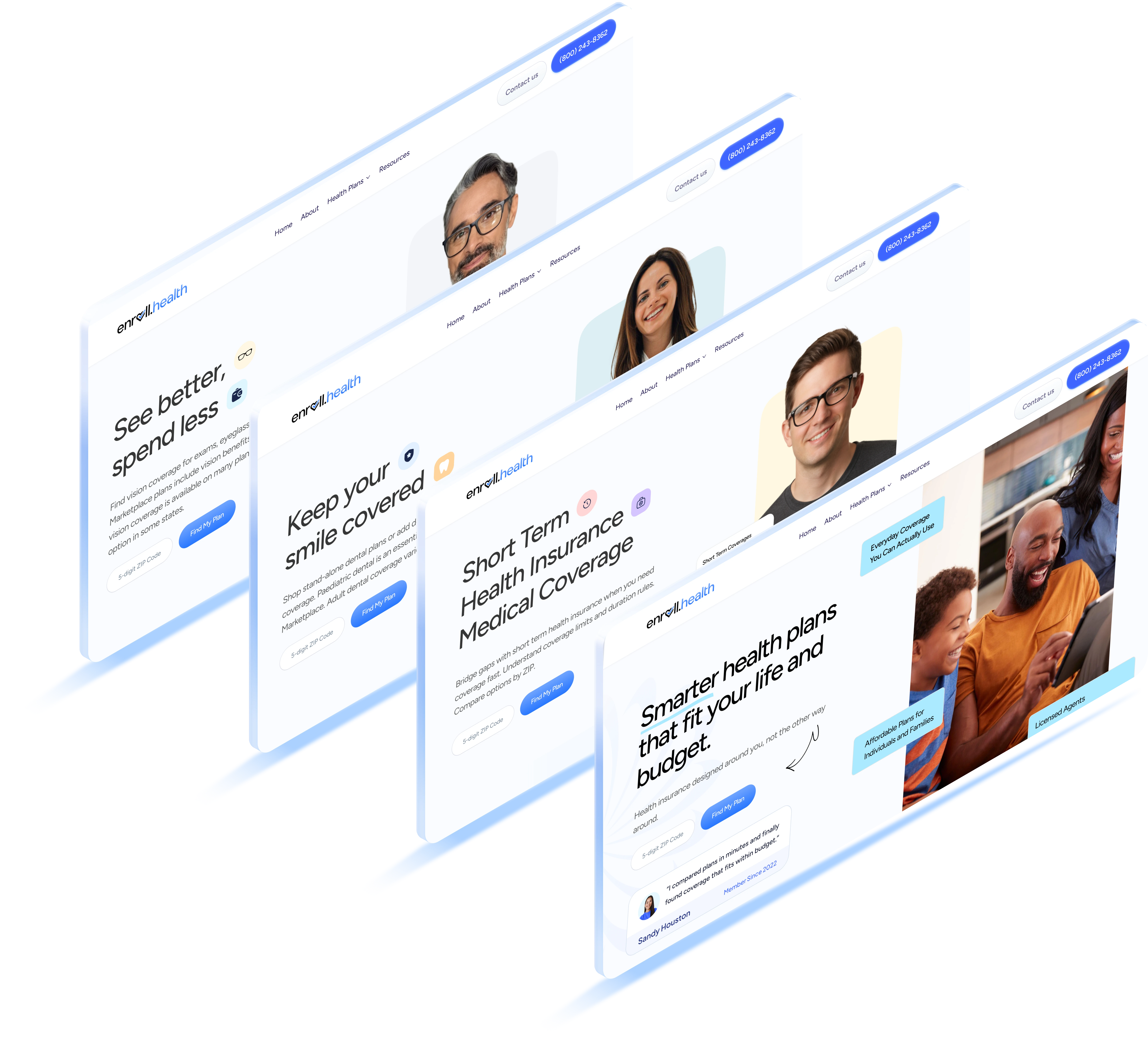
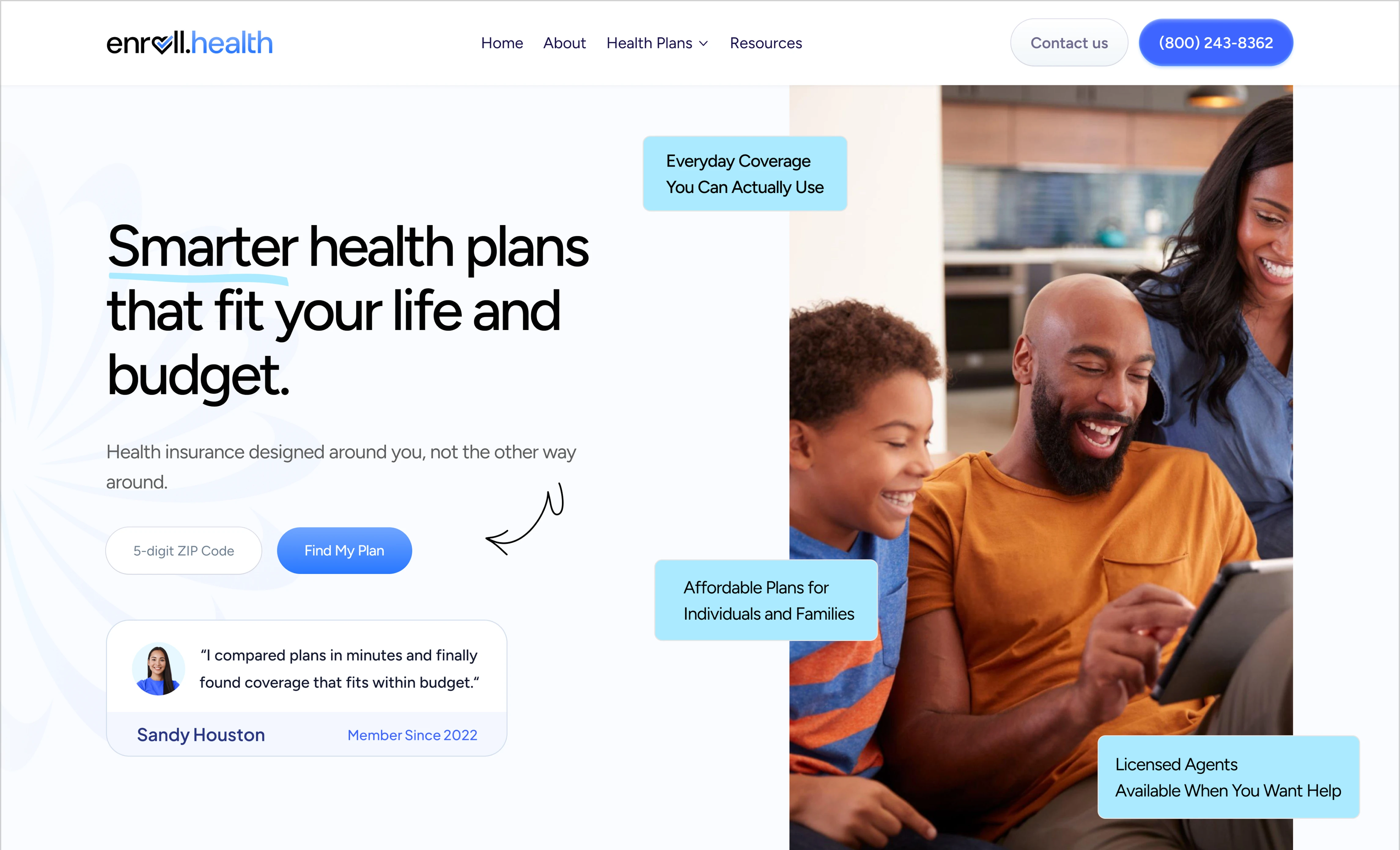
enroll.health wanted a fresh, modern website that made health insurance feel simple instead of stressful. The old site had cluttered layouts, confusing flows, and slow performance. The goal was clear: build a fast, clean, and trustworthy experience where users could compare plans, understand benefits, and get help without feeling lost.
Find the right plan in minutes.
Compare coverage, prices, and benefits without the usual clutter.
See how much you can save instantly.
Smart filters and real-time suggestions help you get the best value.
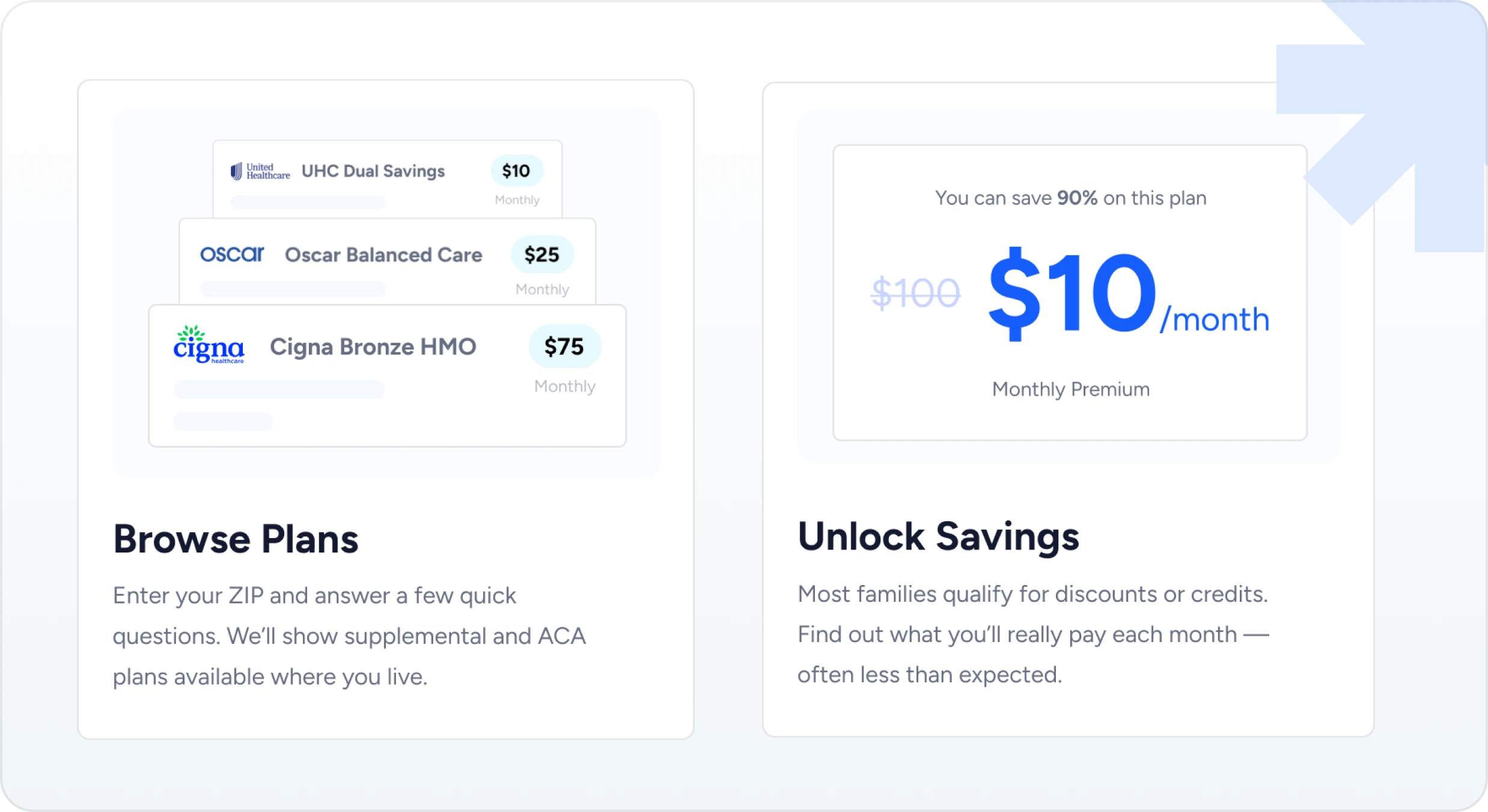
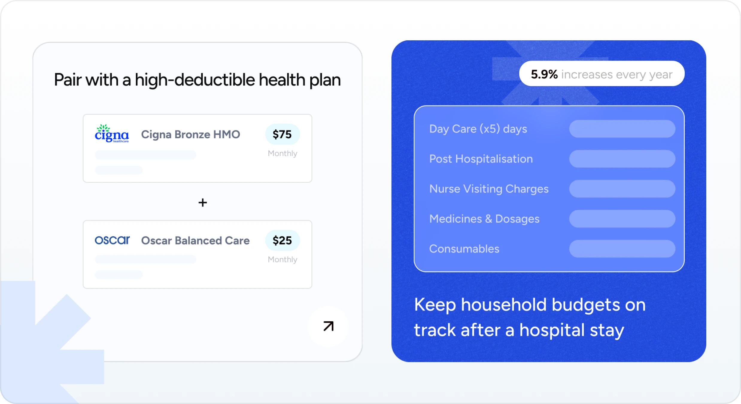
Find your ideal plan fast.
Clean comparisons and simplified details help you choose with confidence.
Instant savings made simple.
See better-priced options based on your needs no extra effort required.
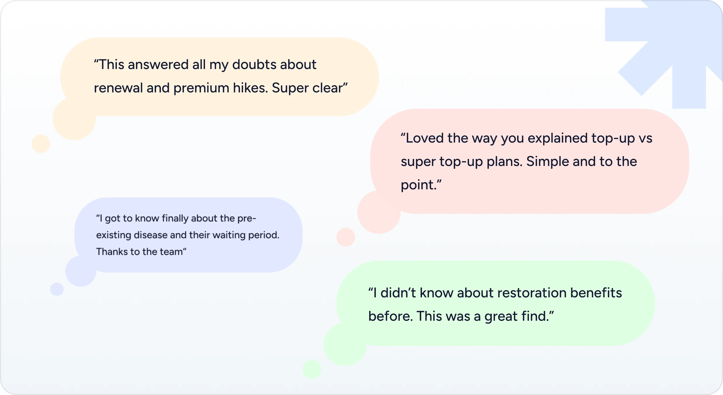
Get clear answers on real questions.
Simple blogs that explain renewals, premium hikes, waiting periods, and more without any jargon.
Understand tricky terms in minutes.
We break down things like top-ups, restoration benefits, and pre-existing conditions in a way anyone can follow.
USER SURVEY & QUANTITIVE RESEARCH
Our team ran a survey to understand what people expect when they shop for health insurance online what they look for, what confuses them, and what matters most during the decision-making process.
What do you seek on a health-insurance site?
What makes buying insurance feel confusing?
What information do you check first before choosing a plan?
What feature would help you choose faster?
What's your biggest fear while buying insurance online?
What helps you trust an insurance platform more?
USER/AGENT PAIN POINTS & INSIGHTS
To understand the real gaps in the old experience, we spoke with both users and agents. Their feedback helped us uncover where they struggled, what slowed them down, and what they expected from a smoother insurance journey. These insights shaped the foundation of our redesign.
AGENT

Too much manual work
Agents had to handle quotes, comparisons, and follow-ups manually, eating up a lot of time.
Hard to explain plans clearly.
Explaining coverage and exclusions to customers took effort due to complicated layouts.
Scattered information.
Important details were spread across multiple screens, slowing down the sales process.
Slow support tools.
Existing tools were not optimized, causing delays during customer calls.
Difficulty guiding users.
Without a clean flow, agents struggled to help users find the right plan quickly.
USER

Hard to compare plans.
Most users felt overwhelmed by too many options and unclear differences between plans.
Most users felt overwhelmed by too many options and unclear differences between plans.
Words like “deductible,” “waiting period,” and “co-pay” made decision-making stressful.
Hard to compare plans.
People weren’t sure what they were actually paying for or what’s included.
Long, complicated flows.
Compare coverage, prices, and benefits without the usual clutter.
Lack of trust.
Users didn’t feel confident whether they were picking the right plan for their needs.
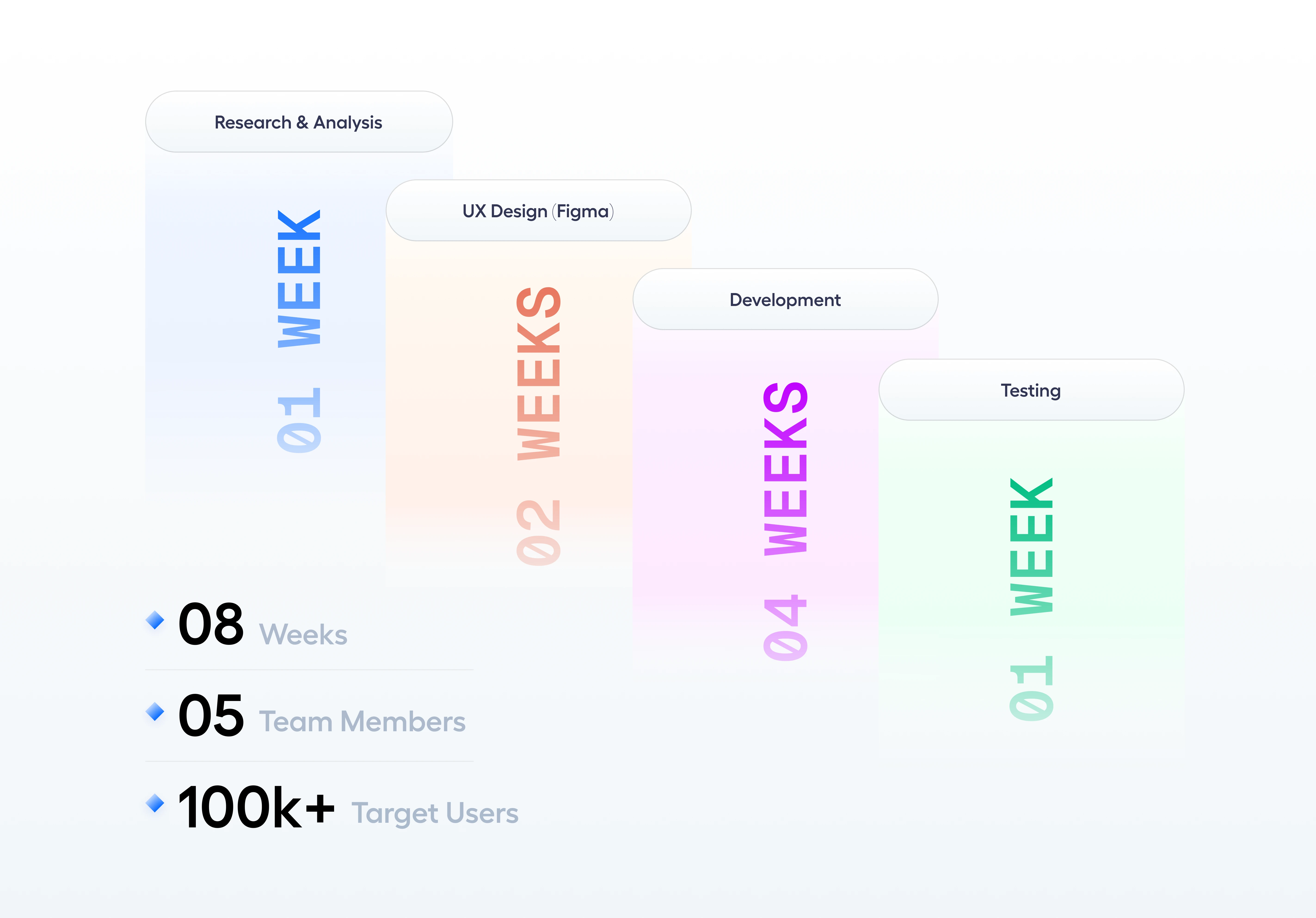
DEVKREST’S ROLE as a team with enroll health
We led the research to understand user needs, redesigned the full experience from the ground up, and rebuilt the website with a fresh, modern identity. From UX flows and UI design to development, testing, and launch — our team made sure every part of the platform felt fast, clear, and easy to use.
A Fresh Identity for a New Experience
The old logo didnot reflect the clarity and trust we wanted users to feel. We refined the identity to make it cleaner, modern, and easier to recognize across digital touchpoints.


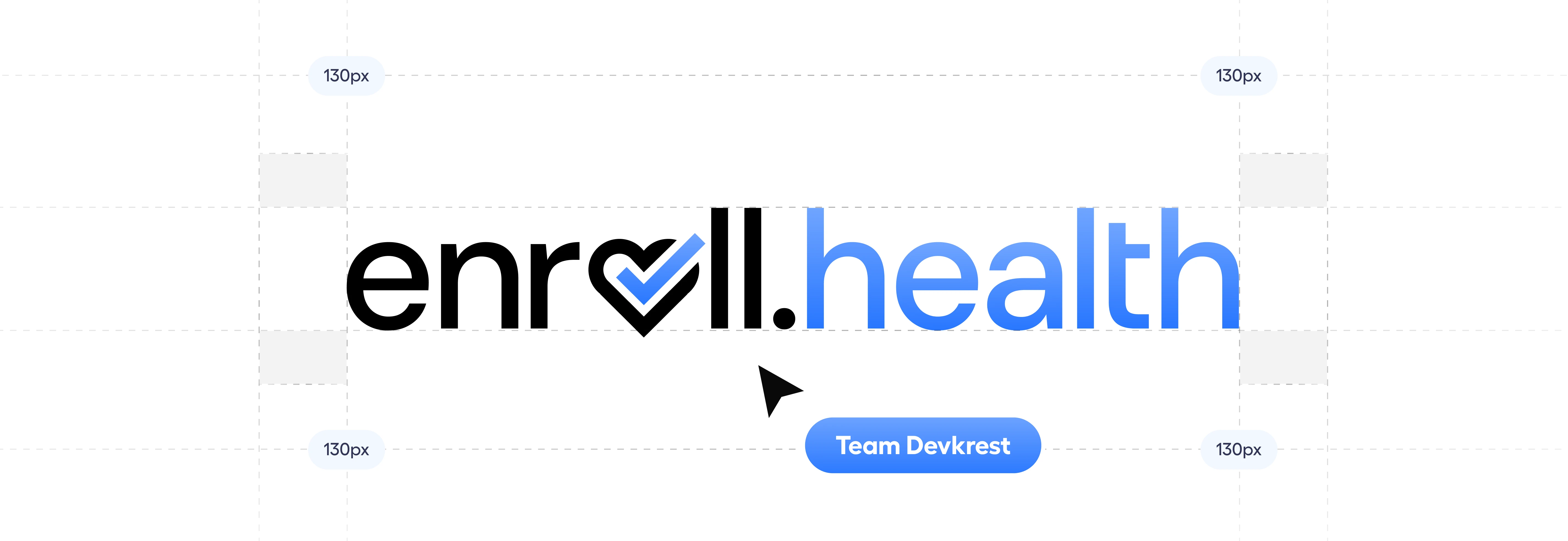

Reimagined by Devkrest
discover-matter

short-term-plans

cash-benefits
everyday-care
shop-individual

contact-us

Communication: The Secret Sauce to Our Success
What made the Cozmo Gearz project shine? Our relentless commitment to transparent communication that kept everyone aligned and excited throughout the journey.
No Surprises, Just Progress
Daily updates via your preferred platform kept everyone informed, eliminating the anxiety of wondering "what's happening with my app today?"
Weekly Deep Dives That Matter
Our focused weekly meetings weren't just check-ins—they were collaborative strategy sessions that kept your vision at the center while driving momentum.
Problems Solved Before They Grew
Our team's proactive approach to challenges meant issues were identified and resolved early—keeping the project on track and your stress levels low.
Full Transparency, Zero Guesswork
Our project tracking system gave you real-time visibility into every milestone, eliminating the black-box development experience that plagues most projects.


